How To Choose Your Wall Paint Colour
One of the quickest ways to give your home a refresh is to give it a lick of paint. But how do you choose the right wall paint colour?
The shade of your wall paint is more important than you might initially think. It may seem simple to choose a plain white wall – and while this can certainly work in your space, it can pay off to think about using colour to bring out the best in your home.
Why not use your walls to compliment the furniture and other elements in your room, as the right colour paint can transform the mood of your home. When choosing the colour of your wall paint, it’s key to ensure it captures the tone you want your home to be. Is your home a minimalist oasis of calm and tranquillity? Or do you want to encourage excitement and energy with bright bold colours?
At Sonya Winner Studio, we recently did a photoshoot of some of our recent rug designs and wanted to make sure the photoshoot studio walls reflected the tone we wanted to create for each room setting, as well as complimenting our rugs. Sonya spent an afternoon working out how to choose the right wall paint for the studio walls.
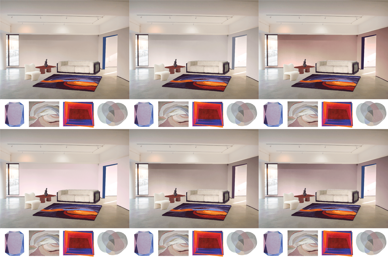
Above are Sonya’s wall paint colour experiments, working with our rug designs as well as our chosen furniture and accessories to create the perfect set for our photoshoot. Sonya chose her wall paint shades from the Farrow and Ball paint family.
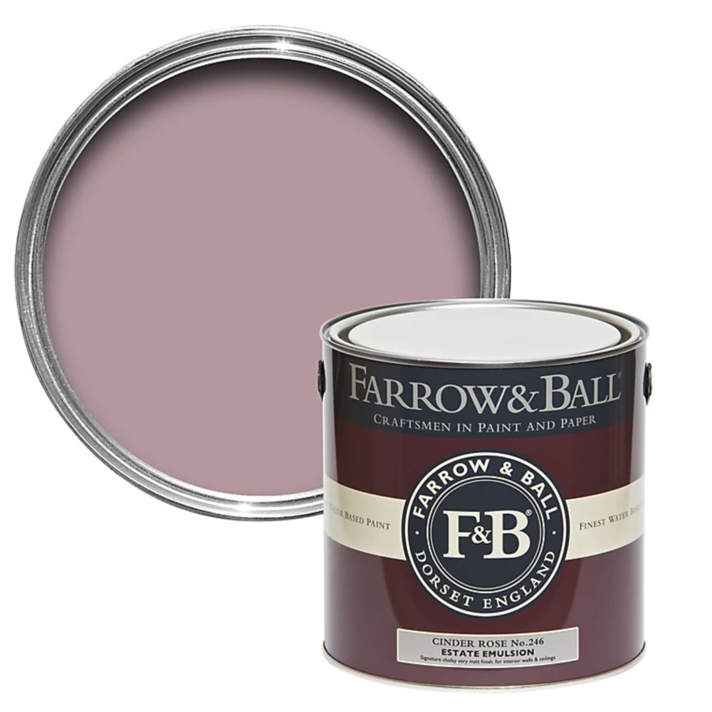
Here are the Farrow and Ball paint swatches visualised in the studio image above:

Sonya came up with some helpful tips for choosing the perfect wall paint colour:
- Create a mood board of photos of the main pieces in your room. You could use Pinterest to create this. Pick out a selection of colours from within your room to try out on the walls digitally or think about much lighter tones that might compliment the elements of your room that you like.
- Work out if your room colour is predominantly warm or cold. Choose a warm colour for your wall paint when most elements are warm tones, and a cool wall colour when most elements are cooler tones.
- Take a picture of your room and upload it to the free Paint Tester app, which allows you to digitally trial the wall colours from your mood board on your walls.
- Compare your images of the different wall colours on one page so that you can view them together to see which colours work best as your new room colour.
These tips will set you well on your way to choosing the perfect wall paint colour. Once we had created our mood boards in the studio, it was time to experiment with our paint swatches!
Choosing a wall paint colour in a warm-toned room

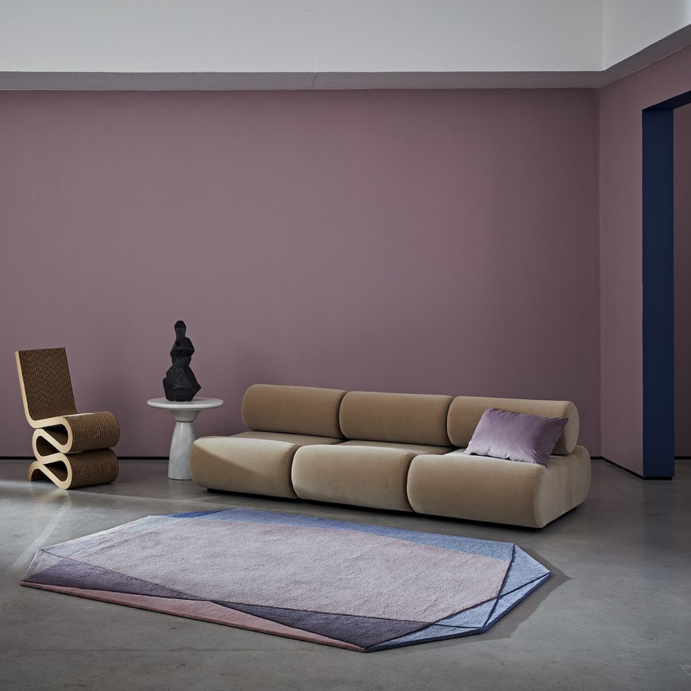
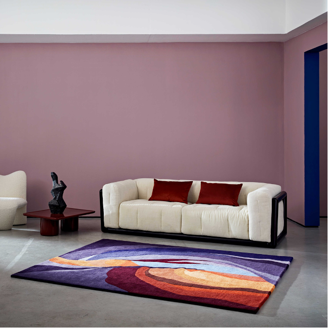
Farrow and Ball’s Cinder Rose paint with our Antelope Canyon Twilight rug
See above the final choice of wall paint colour when photographing our Antelope Canyon Twilight Rug as well the Antelope Canyon Mist, the Jewel Rug Sky Rose and the Magic Stepping Stones Deep Runner. The wall colour we selected was Farrow and Ball Paint in the shade Cinder Rose.
The warm browns, purples and oranges of these rugs were perfectly complemented by the warm, pink-hued wall paint without detracting attention from the rugs themselves. We think this room colour would work perfectly in minimal rooms with an attention-grabbing centrepiece and warm-toned furniture – the shade of the wall in this experiment compliments our warm multi-coloured rug designs which add a transformational level of luxury and warmth to the room.
Choosing a wall paint colour in a cool-toned room
Sonya applied these same principles when choosing the best paint colour for a cooler-toned room. See below how she experimented with different room colour shades to work with another selection of our more colourful and maximalist rug designs.
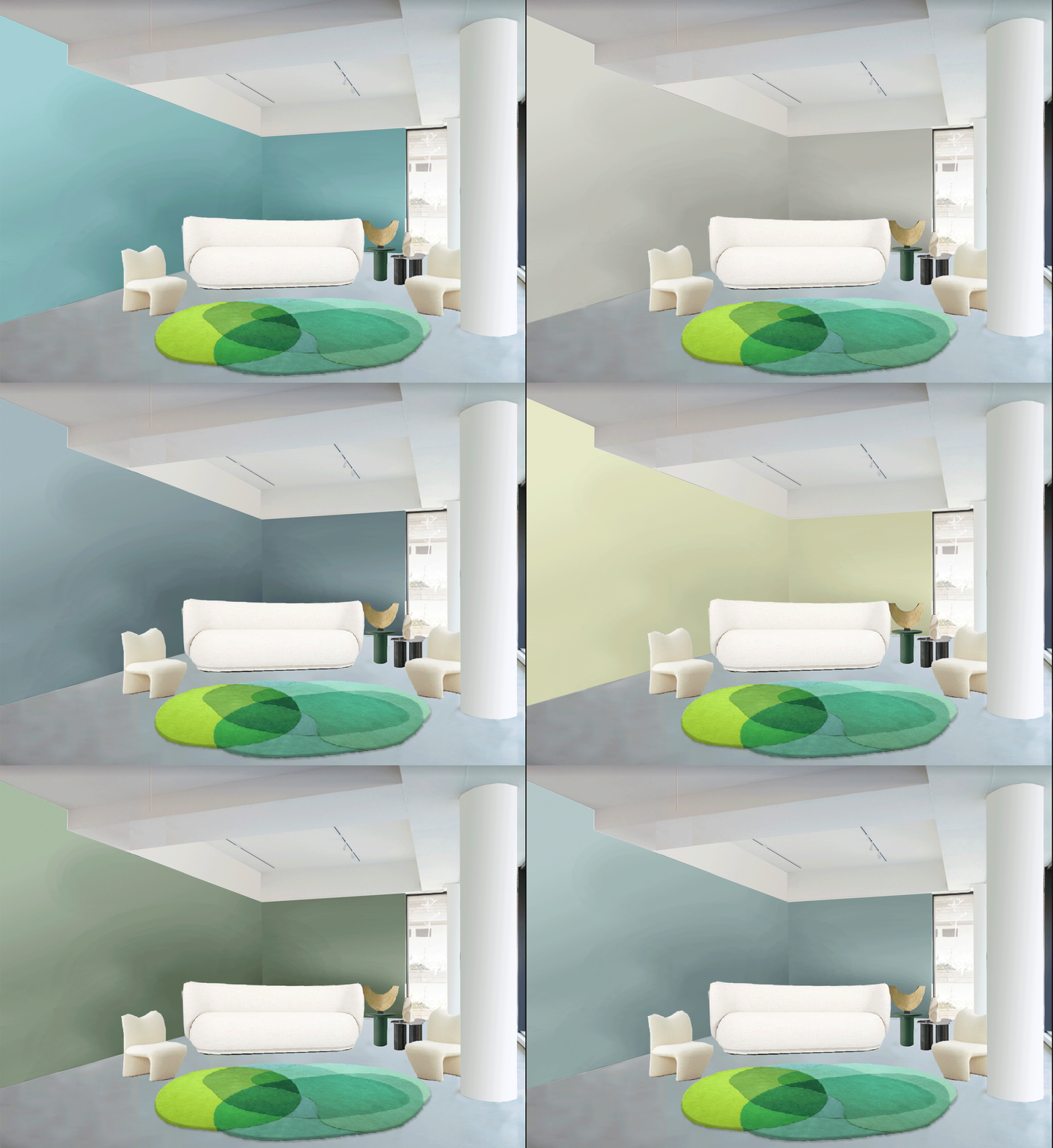

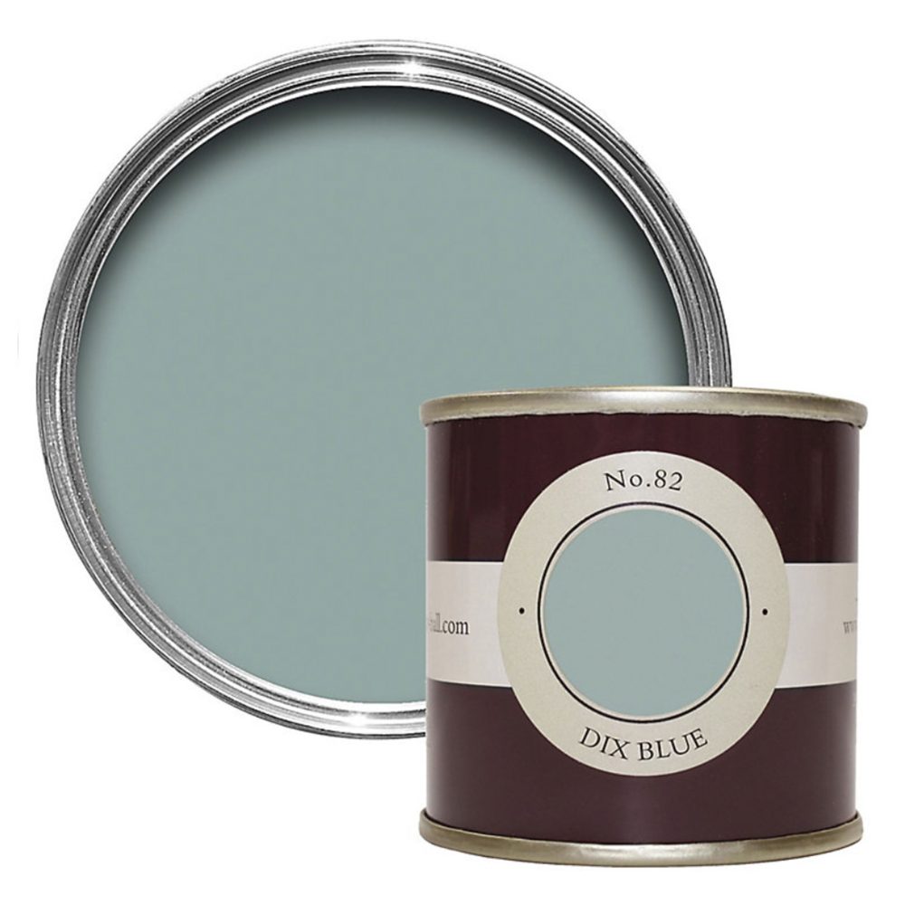
Here are the Farrow and Ball paint swatches visualised in the studio image above:

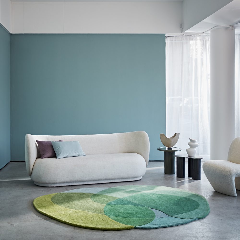
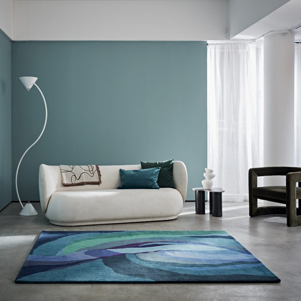
Farrow and Ball’s Dix Blue wall paint with our Jellybean Rug Lime
See above our final choice of the best paint colour when photographing the Colour Canyon, Antelope Canyon Pool, the Happy Rug, Jellybean Lime and Berry and our Colour Wheel Rugs. The room colour selected was Farrow and Ball’s Dix Blue shade.
The more colourful rugs used for this experiment are complemented brilliantly by the greens and blues of cooler-toned wall paint. We think these cool shades would work particularly well in maximalist rooms with bright furniture, or in sleek modern homes with plenty of neutral furniture.
There are many apps to help you in your quest to find the perfect wall colour combination, such as Paint Tester or Benjamin Moore Personal Colour Viewer.
Enjoy visualising the best wall colour combination for your home!

